tion tool designed for displaying building operation data. The design goal is to improve the user's efficiency of monitoring building performance with the available.
A WEB-BASED INTERACTIVE 3D VISUALIZATION TOOL FOR BUILDING DATA Zixiao Shi, William O’Brien, Aly Abdelalim Department of Civil and Environmental Engineering Carleton university Ottawa Ontario, Canada
ABSTRACT This project created a computer information visualization tool designed for displaying building operation data. The design goal is to improve the user’s efficiency of monitoring building performance with the available building information. This tool was formalized based on the existing computer information visualization theories. This tool is capable of displaying a large high-dimension dataset within a single workspace. Interactions were also extensively implemented to encourage epistemic actions and information discovery. A university campus was used for demonstration in this project.1
INTRODUCTION In North America, buildings account for 40% of the total primary energy consumption and greenhouse gas emission [U.S. Department of Energy, 2011]. Unfortunately, building operations are commonly suboptimal. This is even true for many well designed "green" buildings, due to faulty commissioning, equipment deterioration and operation oversight. By maintaining proper operation, buildings’ energy consumption can be reduced by 20% to 30% [Roth et al., 2005]. With the wider adoption of modern sensor network, operation data has become abundant and easily accessible, yet little research has been done on effectively visualizing and presenting those sensor data to the building operators. A powerful and easy to use visualization tool could help the building and facility operators perform their tasks faster and achieve much better energy savings with lower manage1 A demo is available at http://zixiaoshi.github.io/ GeospatialVisualizer/demo.html
ment costs. When monitoring building performance, effective visualization benefits energy and non-energy related tasks in the following aspects [Meyers et al., 1996]: 1. Identify when and where anomalous or incorrect value occurs. 2. Identify when and which system is malfunctioning. 3. Reveal correlations between variables. 4. Identify the minimum data resolution to resolve critical problems. A well designed visualization tool would also be useful to the casual users such as building occupants, by helping them understand related building performance information and promoting awareness of potential energy saving actions. Positive influence on the building occupants’ behavior is one of the most effective ways of reducing building energy consumption [Gunay et al., 2013]. Previous work related to this project includes a web based tool called EnerGIS and was prototyped in 2012, it is capable of displaying multi-level energy data [Kim et al., 2012]. The tool has not made available to public use and the location service it built on, Google Earth, has been deprecated. Another tool designed for building pipelines visualization using BIM and GIS was also developed in recent years [Liu and Issa, 2012]. Abdelalim et al. has also demonstrated using Sankey diagrams and other visualization forms for campus energy data analysis [Abdelalim et al., 2015]. However, a flexible tool capable of displaying continuous data for arbitrary levels of building components from campus level to
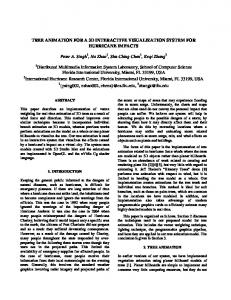
(a)
(b)
Figure 1: Example of target-seeking: (a) black square has unique "fill" feature compared to other distractions; (b) black square has no unique preattentive processing cue individual building system level is still lacking. Also little work has been done in formalizing information visualization theories into building related applications. This project tries to create a tool to address those problems and will be released as an open source project with a working demo. In this paper data from the Carleton University campus was used as a demonstration. Building information was obtained from the building information model (BIM) files as part of the Digital Campus Innovation Project [Shi et al., 2015], and the historical utility data was provided by the University Facility Management and Planning Department.
VISUAL FORMALISM One fundamental building block of the modern information visualization is the affordance theory [Gibson, 1977]. Affordance is the perceivable possibilities for actions in an environment. It is perceived in a direct and immediate way. This means that actions from using visualizations could be encouraged thus evaluated, since the goal for most information visualization is to aid the decision making process [Ware, 2013c]. An optimized visualization design should minimize users’ cost to take an action while maximize benefits of such action to help the users’ decision-making process. In order to minimize the cost of the perceived action when using information visualization, one design concept commonly adopted in the modern information visualization design is to take advantage of the human’s visual preattentive processing. Preattentive processing
in our visual system is performed automatically with very high speed in parallel without focused attention [Treisman, 1985]. This helps users to identify the target information swiftly regardless of the amount of distracting nontargets, if the target information has at least one unique preattentive processing cue unique to the distractors [Healey et al., 1996]. An example is given in Figure 1, the target information is black square and its location. In the figure (a) provides a much better visual design for the user to locate the target information than (b) does due to its unique "filled" feature, even though other features such as shape and asymmetry are all preattentive processing cues, they are not unique. This means if a visualization is designed properly, its users could pick up information of interest much faster visualization designed without preattentive processing cues. In this project preattentive processing cues such as fill, colour, enclosure, asymmetry and motion were incorporated into the visualization tool. With the development of better computation powers and display, 3D visualization has become much more common. Although 3D visualization provides one more dimension to display information than its 2D counterparts, its inherent visual occlusion problem makes it very hard to show a clear and concise overview of the data [Ware, 2013a]. This project uses a combination of 2D and 3D visualization, the 2D section giving users an overview of the information and the 3D sections displaying the geospatial features and their related information. Interactivity is another important aspect in information visualization to enable users’ epistemic actions and
Figure 2: Program Architecture reduce costs of taking such actions. Epistemic action is an activity to discover new information [Ware, 2013d]. Visualization tools with well designed user interactions encourage faster and more epistemic actions, allowing the users to discover more information at a much lower cost. The interactions in this tool include normal navigation actions such as pan, zoom and rotate, as well as many other interactions such as brushing, highlighting, custom data range, level of details, etc. When using visualization, information retained from one fixation to the next is stored in the visual working memory. The memory size is limited to three to five objects and can only store information such as position, abstract shape, colour and texture [Luck and Vogel, 1997]. Since building operation monitoring requires large quantity of information from different systems, displaying more information within the same screen could reduce the requirement of visual working memory. An info box
design was integrated to display related information of the entity so that users do not need going back and forth between different workspaces to retrieve information.
PROGRAM ARCHITECTURE This project is developed upon two existing visualization R packages. Cesium [Analytical Graphics Inc., ] was selected for the 3D geospatial display and geometry hanR dling. Cesium is an open source javascript library specialized for 3D map and dynamic data visualization. It is more powerful and flexible than other alternatives such as Google Earth, which has been deprecated. Another popular open source project d3.js, Data-Driven Documents [Bostock, ], was chosen for the 2D section due to its performance, versatility and maturity. This tool is designed to display any kind of continuous variables with their building objects, and is also ca-
Figure 3: Program Interface pable of displaying data without physical objects. The user interfaces could be customized with additional .css files. The structure of the program is shown in Figure 2. R were incorporated to Some existing classes in Cesium reduce redundant work. The usage of time intervals and time series allows the data source for each entity to be at different resolution and supports extrapolation between data points. Upon program initiation, meta file is loaded in order to define variables, data sources, entity sources and default entity properties; many other default settings could also be altered as optional inputs. The tool allows users to use geojson, topojson and/or information from Building Information Modeling (BIM) files to create and map geospatial objects. Data preparation is required to reduce geometry complexity or include additional information. Once a dataset is selected by the user and all data is loaded. An overview of the data is displayed in the 2D section and animation starts in the 3D section. During each clock tick, depending on the clock multiplier, new values are obtained from the data object, mapped to its corresponding entity and a new scene is rendered in the 3D section. This architecture allows other users to develop new modules for the program or change the templates. This
tool is also designed to be a purely client side application so that it can be incorporated into existing projects.
VISUALIZATION DESIGN DESIGN OVERVIEW The interface of the program is shown in Figure 3. The top-right widget is the user control, which allows users to select variable, dataset and normalization factor for visualization. In the top centre is the legend widget, which display the maximum and minimum data range and can be customized to different colour range and data range. The right widget is the 2D section, which is a heat map providing an overview of the data. The x-axis of the heat map is the time range and y-axis is for different entities(ordinal scale). The bottom widget is timeline and clock, which allows users to change the animation speed, direction and to alter current time in display. All the widgets’ appearance could be customized by changing or using a new .ccs file. The current interface design is still under active development. Colour was used as the main visual cue for continuous data. Users could easily identify colour asymmetries through preattentive processing in the 2D overview and the 3D section. This enables users to identify abnormal
Brushing
Custom Data Range
Timeline Control
Hightlighting
Information Box
Level of Detail Display
Figure 4: Sample Interactions data quickly. If needed, the colour scheme could also be altered by users to cater culture context and avoid colour blindness issues. During data animations, different rates of colour change for different entities could also reveal a sudden jump of value or a high rate of change. The default transparency is also changeable if the user wants to use transparency as a tool to mitigate occlusion issues in the 3D section. If an entity has no data during animation, it is automatically hidden to avoid cluttering and occlusion. This tool is also capable of displaying non-physical geospatial features such as regions and zones. Users could set the extrusion setting to false and the map can be used to display 2D topology information.
USER INTERACTIONS Interaction is the most important aspect of this project, since it is aimed to promote users’ epistemic actions and information discovery. Yi et al. has provided an excellent review of the interactions in visualization [Yi et al., 2007] and summarized seven categories of interaction: select, explore, reconfigure, encode, abstract/elaborate, filter and connect. Most of those categories were experimented and then implemented in this project. Navigation in the 3D section, part of the explore and R filter interactions, is inherited from the Cesium package. Users could use mouse or touch interfaces to pan, rotate and zoom the 3D environment. Additional inter-
actions include resetting the camera to the default view, changing to top-down view to better visualize the topology, as well as clicking on an entity on the heat map to zoom in and focus on the entity. If needed, 2D sections and other widgets could be minimized to provide more space to the 3D section. Those navigation functions provide the fundamental building blocks to the visualization interactions. Normalization function in this tool allows users to specify normalization parameters in the meta data. By default, the data could be normalized by floor area and occupancy. Methodologies of estimating normalization parameters are based on work by Abdelalim et al. [Abdelalim et al., 2015]. When a geospatial feature lacks the corresponding normalization parameter, its data will not be displayed. Normalization allows users to compare variables on a relative basis and perform more in-depth analysis of the data. Users could also filter the features of interest by categories. Categories of each feature could be specified by input file or through APIs. Users could specify which category to display from the user control widget. The default data range is consistent through different categories so that users could compare them against each other. When a lot of data entities are present, the heat map may exceed the vertical screen height and scrolling is needed to navigate through all the features. Scrolling is not always the best option to find information quickly so a sorting function was added to allow users to better filter the data. Users could click on the x-axis to sort the data and its features in descending/ascending order for that specific date. Users could also use an overall sort button and the heat map will be ordered by the maximum/minimum value of each feature by descending/ascending order. This could help users find out important information faster, promoting a more efficient information discovery process. When a geospatial feature is highlighted (hovered over or touched in the 2D section), a black outline is added to the feature in the 3D section and transparency changed to 0 by default. This could help the users to locate the entity on the map. This function is still limited if the feature is too small or occluded by other taller features. Other highlighting techniques will need to be added in the future. Originally used in scatterplot matrix by Becker et. al. [Becker and Cleveland, 1987], Brushing has become widely adopted in many visualization tools. Brushing
links the two visualization sections and allows users to focus on more important information interactively. In this tool, brushing is accomplished by two methods: brushing by data range and brushing by feature. After the user has customized the data range, the features with values below the data range are displayed white with a high transparency, and features with values above the data range are displayed solid black. Since most users are interested in identifying higher values, this brushing implementation makes the features with high values more visually dominant. Users could also select which features to display in the 2D heat map section with batch display/hide buttons. By default, all features are displayed, but combined with the sorting function so that users could quickly pick the features of interest and explore information with less distractions or occlusions. Brushing by feature is also persistent when the user changes the variable, this is designed based on the workflow that users could explore other related variables for the feature of interest. During the decision making process, users often need extra information about the geospatial feature itself. An information box widget was designed to contain those related information. The information box contains feature’s id, name, category, current value and all data specified under the properties. Users could specify which properties to read through the meta file and data inputs, as well as through the program APIs. Once a feature is clicked on the 2D or 3D section, the information box is displayed for further analysis. The information box is not yet fully automated for different file inputs and manual meta file definition is needed. In building operations, users often need to investigate issues using a top-down method (from buildings to floors to zones). This tool also offers a "level of detail" interaction, allowing the user to further inspect sub levels’ performances in the same workspace. If a sub level data source is supplied in for each feature, a button is added to the information box to further visualize those details. Once selected, the default data range will be reset and sub level features will be displayed in place of existing information to reduce occlusion and cluttering. However, previous brushing is persistent and the user could revert back to previous level. A feature could contain arbitrary number of sub features and any number of levels, but the performance of the tool may decrease if too many levels of details are loaded.
Data: Monthly electricity consumption datasets for buildings displayed in a single line chart Result: When, where and how much maximum electricity consumption occurred initialization; while Highest electricity consumption not found do find next highest point on the line chart; identify when the highest point occurred on x-axis; identify line and match the corresponding building from legend; if cannot recognize building from working memory/long term memory(experts) then memorize building name; use another workspace to find if the building’s category; end if building is residential then if does not know the location of the building from memory then use campus map to search for the location; end result found; end end Algorithm 1: Sample Visual Thinking Algorithm with Spreadsheet and Line Plot
VISUAL THINKING ALGORITHMS Visual thinking algorithm is a concept coined out by Wares [Ware, 2013b]. It is a conceptual algorithm that integrates perceptual and cognitive actions with visualization. Computer based computation is part of the algorithm and is guided by user inputs. Essentially every information-seeking process using information visualization is a visual thinking algorithm. Designing and evaluating visual thinking processes helps to implement, improve and compare visualizations, especially for complicated tasks. It is also helpful to evaluate the processing time and visual working memory use. Visual cue perception time and number of features need to be stored in visual working memory could cause large differences in affordance. In this project, visual thinking algorithms were proposed and implemented iteratively to improve the tool’s design. To give an example of visual thinking algorithms pro-
Data: Monthly electricity consumption datasets for buildings Result: When, where and how much maximum electricity consumption occurred initialization; read and store legend information; select residential from category filter; use the overall descending sort button on the heat map; hover over or click on the first building to identify its location; scan the colour bar of the building and locate when did the maximum consumption occurred; result found; Algorithm 2: Sample Visual Thinking Algorithm with Proposed Tool
posed in this project, a sample task of finding out when, where and how much maximum monthly electricity consumption occurred in student residential buildings was used. Two visual thinking algorithms using traditional spreadsheets and the proposed tool were developed to compare their theoretical performances. Comparing Algorithm 1 and 2 revealed that shorter epistemic actions [Ware, 2013b] are required in the proposed tool, compared to more working memory queries(professionals), higher cognitive effort and potentially much more iterations when using the traditional spreadsheets and line plots. Visual thinking algorithms could also help train users to perform certain tasks when using the tool. However, it should be noted that the potential usability of the tool is not limited by existing algorithms and could be exploited for more tasks.
DISCUSSIONS R Cesium is a powerful tool with extensive capability of displaying geospatial features and dynamic data. However, it uses WebGL, which is not well optimized to take advantage of parallel processing with modern graphic processors. On some slower computer or mobile devices, this issue becomes very significant as the frame rate drop is noticeable. Also not all browsers support WebGL, as of now only Firefox and Chrome have excellent support. Common campus and building applications should have an agreeable performance on most desktop computers. Due to the limitation posed by WebGL and
browser, this tool may not be very suitable to significantly large datasets. Testing with very large dataset is needed. Also many advanced features are still missing, for example more flexible camera controls and object interactions. Occlusion, a classical problem in 3D visualization, is still an issue in the 3D section. Wire frame see-through for occluded entities would work well, but it requires additional time to implement. More work to reduce the information loss by occlusion is needed. There is also a lack of standard protocol for building data and information for visualization. Although not directly related to information visualization, the obstacles met during data acquisition and preparation during this project were significant. Each control or monitoring system provider has own data format, and typically support for API based access is limited. More open and transparent data access for building operation data and building information is under active research. This tool has been presented to some facility management personnel and companies, from anecdotal evidence this tool has received very positive response. Based on design theories this should provide better user experience than traditional tools, but future experiments and evaluations are needed to test this tool rigorously. This tool could also be used to display building simulation results due to its capability of importing data with API. The animation functions could also be used to display data from running simulations. This could be used to help users make decisions during parametric design simulations. Integration with existing building simulation tools such as EnergyPlus will be investigated in the future.
CONCLUSIONS In this project a prototype of displaying continuous data for building objects has been developed. It was designed for exploratory information seeking for building operators and casual users. Application of computer information visualization theories could be very useful to the building and facility management industry, thus improving overall performance of building systems as a whole. At the current state, this research field is still lacking and most of the information visualization used in the commonly used building/facility management tools is poorly designed with little visual formalism. With the increasingly integration of digital building models (BIM) and
advanced sensor networks, how to adequately visualize this huge amount of data to help the stakeholders is going to be a critical work. This project aims to inspire more researchers other stakeholders to look at this problem and prepare for the arriving of this digitalized, data dominated building operation era.
ACKNOWLEDGEMENTS R This project is supported by Autodesk Research. We thank the Carleton University Facility Management and Planning Department who has shared data and provided expertise throughout the research. We also thank professor Robert Biddle from the Carleton University HumanComputer Interaction Department for his knowledge and advise in Computer Information Visualization.
REFERENCES [Abdelalim et al., 2015] Abdelalim, A., O’Brien, W., and Shi, Z. (2015). Visualization of energy and water consumption and ghg emissions: A case study of a canadian university campus. Energy and Buildings, 109:334–352. [Analytical Graphics Inc., ] Analytical Graphics Inc. Cesium. http://cesiumjs.org/. [Becker and Cleveland, 1987] Becker, R. a. and Cleveland, W. S. (1987). Brushing Scatterplots. Technometrics, 29(2):127–142. [Bostock, ] Bostock, M. Data-driven documents. http: //d3js.org/. [Gibson, 1977] Gibson, J. J. (1977). The theory of affordances. Hilldale, USA. [Gunay et al., 2013] Gunay, H. B., O’Brien, W., and Beausoleil-Morrison, I. (2013). A critical review of observation studies, modeling, and simulation of adaptive occupant behaviors in offices. Building and Environment, 70:31 – 47. [Healey et al., 1996] Healey, C. G., Booth, K. S., and Enns, J. T. (1996). High-speed visual estimation using preattentive processing. ACM Transactions on Computer-Human Interaction, 3(2):107–135. [Kim et al., 2012] Kim, S. A., Shin, D., Choe, Y., Seibert, T., and Walz, S. P. (2012). Integrated energy
monitoring and visualization system for Smart Green City development: Designing a spatial information integrated energy monitoring model in the context of massive data management on a web based platform. Automation in Construction, 22:51–59. [Liu and Issa, 2012] Liu, R. and Issa, R. (2012). 3D Visualization of Sub-surface Pipelines in Connection with the Building Utilities: Integrating GIS and BIM for Facility Management. In Computing in Civil Engineering, pages 341–348. [Luck and Vogel, 1997] Luck, S. J. and Vogel, E. K. (1997). The capacity of visual working memory for features and conjunctions. Nature, 390(6657):279– 281. [Meyers et al., 1996] Meyers, S., Mills, E., Chen, A., and Demsetz, L. (1996). Building Data Visualization for Diagnostics. ASHRAE Journal, (June):63–72. [Roth et al., 2005] Roth, K. W., Westphalen, D., Feng, M. Y., Llana, P., and Quartararo, L. (2005). Energy impact of commercial building controls and performance diagnostics: market characterization, energy impact of building faults and energy savings potential. Prepared by TAIX LLC for the US Department of Energy. [Shi et al., 2015] Shi, Z., Abdelalim, A., O’Brien, W., Attar, R., Akiki, P., Graham, K., Van Waarden, B., Fai, S., Tessier, A., and Khan, A. (2015). Digital campus innovation project: integration of building information modelling with building performance simulation and building diagnostics. In Proceedings of the Symposium on Simulation for Architecture & Urban Design, pages 51–58. Society for Computer Simulation International. [Treisman, 1985] Treisman, A. (1985). Preattentive processing in vision. Computer Vision, Graphics, and Image Processing, 31(2):156–177. [U.S. Department of Energy, 2011] U.S. Department of Energy (2011). Building energy data book. Technical report. [Ware, 2013a] Ware, C. (2013a). Chapter 7 - Space Perception. In An Introduction to the Psychology of Hearing, pages 233–267. Morgan Kaufmann.
[Ware, 2013b] Ware, C. (2013b). Chapter Eleven - Visual Thinking Processes. In Information Visualization, pages 375–423. Morgan Kaufmann. [Ware, 2013c] Ware, C. (2013c). Chapter One - Foundations for an Applied Science of Data Visualization. In Information Visualization, pages 1–30. Morgan Kaufmann. [Ware, 2013d] Ware, C. (2013d). Chapter Ten - Interacting with Visualizations. In Information Visualization, number 1994, pages 345–374. Morgan Kaufmann. [Yi et al., 2007] Yi, J. S., Kang, Y. A., Stasko, J., and Jacko, J. (2007). Toward a deeper understanding of the role of interaction in information visualization. IEEE transactions on visualization and computer graphics, 13(6):1224–31.